Print as the conversation starter
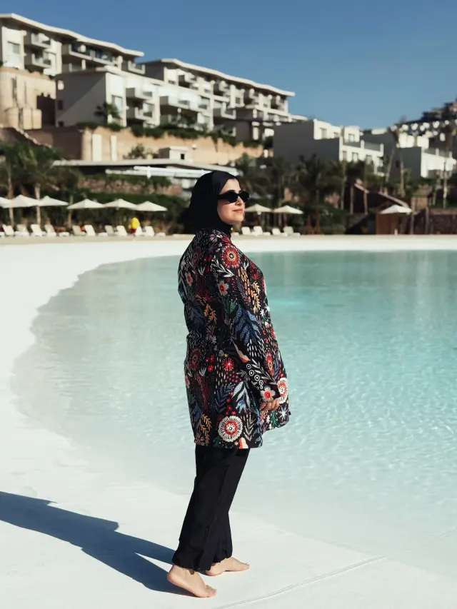
The hip-length tunic does the heavy lifting here. Its all-over abstract floral and paisley motifs in red, yellow, white and black read like a vintage scarf worn large: busy but organised by a straight, collared silhouette. The print’s warm accents, particularly the pops of yellow and red, bring a sunny, resort-ready mood that plays well against the more restrained shapes elsewhere. Because the tunic is a lightweight woven, it keeps movement soft rather than boxy, which prevents the pattern from overwhelming the silhouette.
Trousers that control the composition
The black trousers act as a visual base, their loose fit softening the tunic’s graphic energy. A drawstring at the ankle gathers the fabric so the full-length trouser reads cropped in proportion; that narrow break at the ankle prevents the look from feeling heavy and creates a tidy counterpoint to the tunic’s relaxed straight line. The dark colour also stops the print from spiralling into excess, keeping the overall impression grounded and wearable for everyday or vacation settings.
Accessories as finishing punctuation
Styling is decisive and minimal. A fitted black headscarf frames the neckline and preserves the outfit’s modest, vintage spirit while echoing the trousers’ black anchor. Rectangular black sunglasses add a slightly modern edge and maintain visual continuity from head to toe. Together these choices turn a colourful tunic into a coherent ensemble: the accessories are not decorative afterthoughts but the key devices that restrain and refine the print.